 ApostropheCMS
Composing custom schema fields from standard fields
Introduction
Apostrophe comes with a large number of schema field types. If these field types aren't sufficient for your project, Apostrophe makes adding a new custom schema field relatively easy and you can read more about it in the documentation. However, many times when we need a custom field type, it is simply a combination of existing field types working together for a new outcome. Luckily, Apostrophe was designed to allow you to reuse existing field types to create new fields with a custom look.
In this recipe, we are going to build two different customized schema fields. The first will be a simple set of integer fields to collect grade information. The second will be a gradient background creator with integer and color fields, within an array. Overall, the steps to building both will be almost identical. However, we are going to build the grade field as part of a piece and the gradient as a stand-alone module. This will demonstrate the changes you need to make when building your custom schema field in a module that doesn't extend another core module and changes that need to be made to object and array schema input fields when you use them this way.
Structure of a schema field
A schema input field has two parts: a server-side part and a browser-side part.
The server-side code handles registering the schema field type, plus sanitizing and storing the data in the database. Most of this code will be the same for each custom field. We can take advantage of the same code that the Apostrophe core uses for sanitization and storage.
The browser-side code provides the admin UI and is where we will take advantage of the built-in fields to lighten the programming load. Apostrophe has two Vue components and a mixin file to assist with schema creation. The first component is the AposInputWrapper. This component helps with field validation and appearance. The other is the AposSchema component. This Vue component parses through a supplied schema of fields and implements the v-model that allows two-way data binding between a value in our template and a value in our data properties. Apostrophe provides the AposInputMixin mixin to facilitate passing props, display modifications, and event listeners.
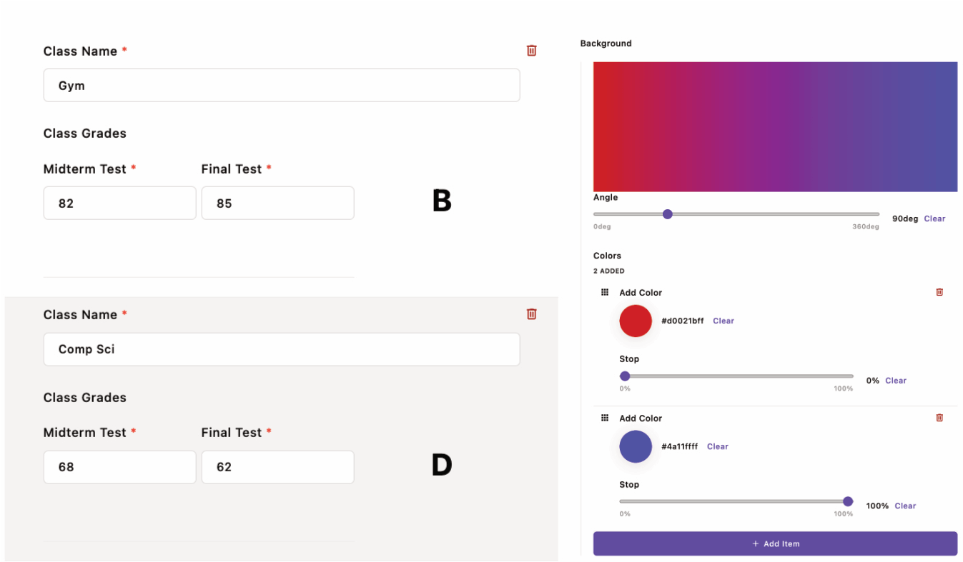
Building the custom grade field type
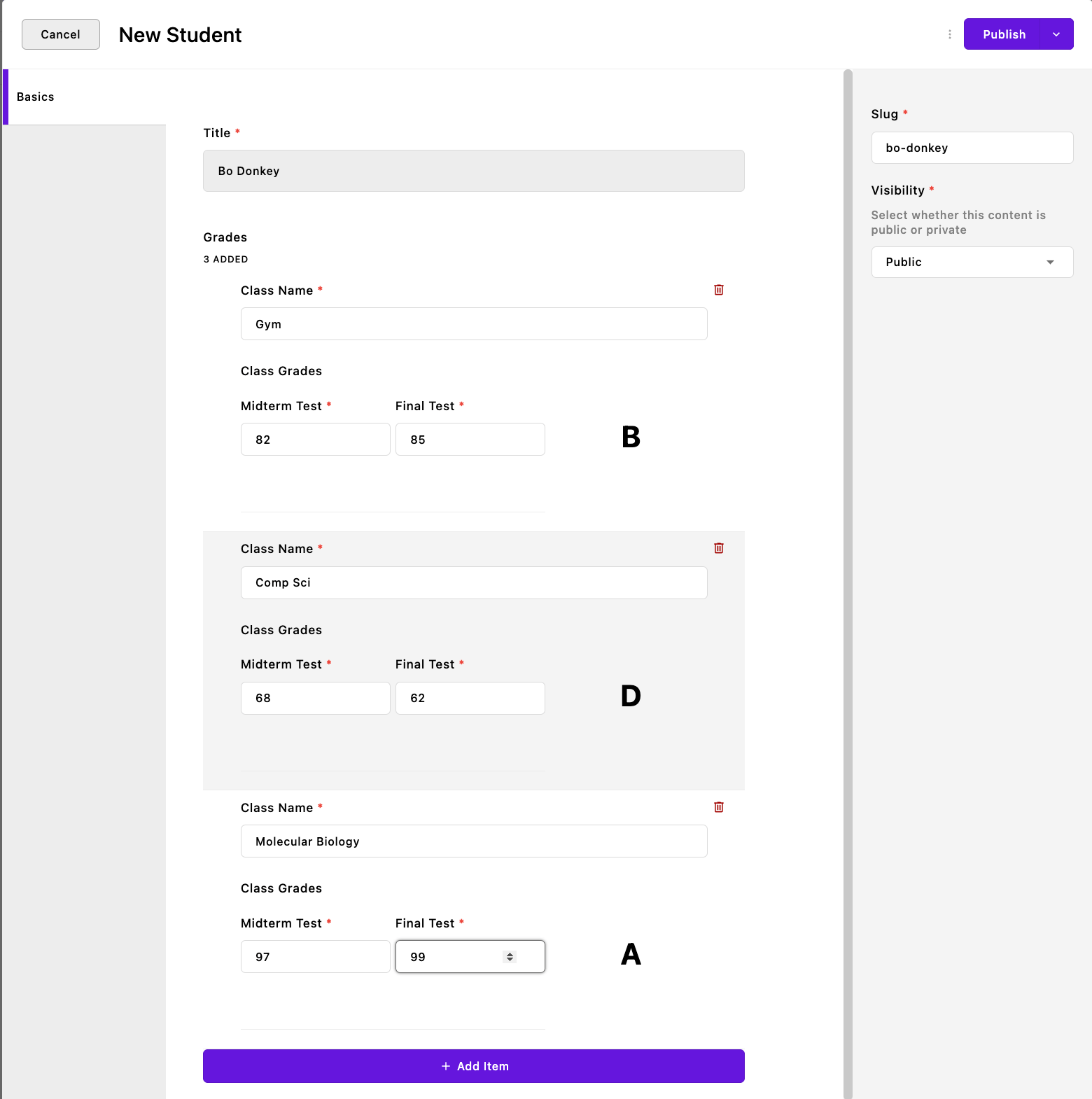 This custom field makes it easier for our CMS user, a teacher, to enter the grades for a student. Each set of grades is stored as a piece with the student's name as the
 Title field. Our custom schema makes it easy for the teacher to keep the mid-term and final grades organized for each class. In addition, the field will calculate the letter grade based on the student's scores. Obviously, this example is overly simplistic. We could just as easily have added a string and two integer fields into an array field to achieve almost the same thing, but that poor teacher would have had to average the grades and convert it to a letter themselves!
Implementing the server-side code
For this example, we are creating a new piece-type module.
module.exports = {
  extend: '@apostrophecms/piece-type',
  options: {
    label: 'Student'
    // Additionally add a `pluralLabel` option if needed.
  },
  fields: {
    add: {
      grades: {
        label: 'Grades',
        type: 'array',
        inline: true,
        table: true,
        fields: {
          add: {
            className: {
              label: 'Class Name',
              type: 'string',
              required: true
            },
            grades: {
              label: 'Class Grades',
              type: 'grades'
            }
          }
        }
      }
    },
    group: {
      basics: {
        label: 'Basics',
        fields: [ 'title', 'grades' ]
        }
    }
  },
  init(self) {
    self.addGradeFieldType();
  },
  methods(self) {
    return {
      addGradeFieldType() {
        self.apos.schema.addFieldType({
          name: 'grades',
          convert: self.convertInput,
          vueComponent: 'InputGradeField'
        });
      },
      exposeSchema() {
        const schema = [
          {
            type: 'integer',
            name: 'midterm',
            label: 'Midterm Test',
            required: true
          },
          {
            type: 'integer',
            name: 'final',
            label: 'Final Test',
            required: true
          }
        ];
        return schema;
      },
      async convertInput(req, field, data, object) {
        data = data[field.name];
        const errors = [];
        const result = {};
        if (data == null || typeof data !== 'object' || Array.isArray(data)) {
          data = {};
        }
        const schema = self.exposeSchema();
        try {
          await self.apos.schema.convert(req, schema, data, result);
        } catch (e) {
          for (const error of e) {
            errors.push({
              path: error.path,
              error: error.error
            });
          }
        }
        object[field.name] = result;
        if (errors.length) {
          throw errors;
        }
      }
    };
  },
  extendMethods(self) {
    return {
      getBrowserData(_super, req) {
        const browserData = _super(req);
        browserData.gradeSchema = self.exposeSchema();
        return browserData;
      }
    };
  }
};
This piece contains only two fields. A string field for the class name and the new schema field, grades, both inside an array schema field.
Within the init(self) function, we make a call to the method that will register and create our new schema field type.
init(self) {
  self.addGradeFieldType();
}
The methods(self) configuration function is a bit more complicated. There are three methods. The first of these registers the new custom field.
addGradeFieldType() {
  self.apos.schema.addFieldType({
    name: 'grades',
    convert: self.convertInput,
    vueComponent: 'InputGradeField'
  });
}
We are passing the addFieldType() method of the @apostrophecms/schema module an object with three properties. The first is the name that will be used within any schema utilizing this field, grades. The convert key points to the method that will be used to sanitize and store the data. Finally, the vueComponent key takes the file name for our Vue component located in the modules/grade/ui/apos/components folder.
exposeSchema() {
  const schema = [
  👉🏻{
    👉🏻name: 'midterm',
      type: 'integer',
      label: 'Midterm Test',
      required: true
    },
    {
      name: 'final',
      type: 'integer',
      label: 'Final Test',
      required: true
    }
  ];
  return schema;
}
The next method, exposeSchema(), allows us to reuse the schema for our component in the convert method, as well as in our Vue component.
The schema should be passed as an array of objects. This is slightly different than how we typically format our schema as an object composed of named objects, so the name field moves inside the object.
async convertInput(req, field, data, object) {
  data = data[field.name];
  const schema = self.exposeSchema();
  const errors = [];
  const result = {};
  if (data == null || typeof data !== 'object' || Array.isArray(data)) {
    data = {};
  }
  ...
}
The final method, convertInput(), accepts the data from the component inputs, makes sure the data is in an expected form, and then passes each data field through a launder method. The final data is returned as an object that gets stored by Apostrophe in the database. The first section of this method prepares the data for sanitization and storage.
This method takes four arguments from the Vue component. The two most important for this recipe are the data and object arguments. data is going to contain all of the data being delivered from the input fields. We are only interested in managing the data from our new custom field, so in the very first line of the method we reassign data as being equal to only the data coming from our field using data = data[field.name].
We next pull in the schema we defined above using the exposeSchema() method. This schema is used to inform the convert() method of what types of data laundering methods to use.
The errors and results variables are next initialized so that they can take values returned from the @apostrophecms/schema module convert() method.
Before passing our data to the convert() method we ensure that it is a non-array object. If not, the data coming back from the component can't be sanitized and instead is discarded.
try {
  await self.apos.schema.convert(req, schema, data, result);
} catch (e) {
  for (const error of e) {
    errors.push({
      path: error.path,
      error: error.error
    });
  }
}
object[field.name] = result;
if (errors.length) {
  throw errors;
}
After prepping the argument data, we invoke the @apostrophecms/schema module convert() method within a try-catch block.
This either populates our result variable with the sanitized data or throws errors that are pushed to the errors variable.
Lastly, we assign those results to the object parameter. If no errors came back from the convert() method this object is saved to the database.
extendMethods(self) {
  return {
    getBrowserData(_super, req) {
      const browserData = _super(req);
      browserData.gradeSchema = self.exposeSchema();
      return browserData;
    }
  };
}
The last module configuration function that we are setting for this module is extendMethods(self). In order to expose our schema to the Vue component, we need to add it to the data made available by this module in the browser-side JavaScript. This is accomplished through the getBrowserData() method. In this case, we don't want to replace the base @apostrophecms/piece-type method, only extend it.
The _super argument is passing the original function (you can read more about this pattern in the documentation). The original method takes a single argument, req, that is passed as the second argument.
The browserData variable is set to the return value of the original function by invoking the original method with the req argument. That object is then updated with the custom schema array and returned.
Creating the Vue component
The custom field browser-side code should be added to your module's ui/apos/components folder. The file name should match the value of the vueComponent property of the object passed to the self.apos.schema.addFieldType() method.
<template>
  <AposInputWrapper :field="field" :error="effectiveError" :uid="uid" :modifiers="modifiers">
    <template #body>
      <div class="custom-input-object">
        <div class="custom-input-wrapper">
          <AposSchema :schema="gradeSchema" :trigger-validation="triggerValidation" :generation="generation" v-model="gradeSchemaInput">
          </AposSchema>
          <span class="letter-grade">{{ letterGrade() }}</span>
        </div>
      </div>
    </template>
  </AposInputWrapper>
</template>

<script>
import AposInputMixin from 'apostrophe/modules/@apostrophecms/schema/ui/apos/mixins/AposInputMixin';
import AposInputWrapper from 'apostrophe/modules/@apostrophecms/schema/ui/apos/components/AposInputWrapper.vue';
import AposSchema from 'apostrophe/modules/@apostrophecms/schema/ui/apos/components/AposSchema.vue';

export default {
  name: 'InputGradeField',
  mixins: [AposInputMixin],
  components: {
    AposInputWrapper,
    AposSchema
  },
  props: {
    generation: {
      type: Number,
      required: false,
      default() {
        return null;
      }
    }
  },
  data() {
    const next = this.getNext();
    const gradeSchema = apos.modules['student'].gradeSchema;
    return {
      next,
      gradeSchemaInput: {
        data: next
      },
      gradeSchema: gradeSchema
    };
  },
  watch: {
    generation() {
      this.next = this.getNext();
      this.gradeSchemaInput = {
        data: this.next.value
      };
    },
    gradeSchemaInput: {
      deep: true,
      handler() {
        if (!this.gradeSchemaInput.hasErrors) {
          this.next = this.gradeSchemaInput.data;
        };
      }
    }
  },
  methods: {
    getNext() {
      return this.value.data ? this.value.data : (this.field.def || {});
    },
    validate(value) {
      if (this.gradeSchemaInput.hasErrors) {
        return 'invalid';
      }
      return false;
    },
    letterGrade() {
      if (this.next.midterm || this.next.final) {
        const midterm = this.next.midterm;
        const final = this.next.final;
        const average = (midterm !== undefined && final !== undefined) ? (midterm + final) / 2 : (midterm !== undefined ? midterm : final);
        const gradeRanges = [
          { min: 90, max: 100, letterGrade: 'A' },
          { min: 80, max: 89, letterGrade: 'B' },
          { min: 70, max: 79, letterGrade: 'C' },
          { min: 60, max: 69, letterGrade: 'D' },
          { min: 0, max: 59, letterGrade: 'F' },
        ];

        const { letterGrade } = gradeRanges.find(({ min, max }) => average >= min && average <= max);

        return letterGrade;
      }
      return '';
    }
  }
};
</script>

<style lang="scss" scoped>
.custom-input-object {
  .custom-input-wrapper {
    display: flex;
    flex-direction: row;

    .apos-schema {
      flex: 2;
      margin-right: 10px;
      display: flex;
      flex-direction: row;

      [data-apos-field] {
        margin-left: 10px;

        &:first-child {
          margin-left: 0;
        }
      }
    }

    .letter-grade {
      flex: 1;
      display: flex;
      align-items: center;
      justify-content: center;
      font-size: 2rem;
      font-weight: bold;
      margin-bottom: 30px;
    }
  }
}
</style>
The schema field markup
<AposInputWrapper :field="field" :error="null" :uid="uid" :modifiers="modifiers">
...
</AposInputWrapper>
For our custom schema field, we are utilizing two helper components from the @apostrophecms/schema module. The first is the AposInputWrapper. This component is used for error handling and input appearance, as well as behind-the-scenes housekeeping. It wraps the entire code block where the Apostrophe schema fields are being used. Four props are typically passed to this component.
The only one that we might want to change the value of is :error. It can take values of either "null" or "effectiveError". If you are making a component that has multiple schema fields and set :error to "null", errors will only be shown for the individual fields, not the top-level component. Setting it to "effectiveError" will show errors in the individual fields, as well as the entire custom schema field. It is a judgment call to determine which will result in a better user experience.
:::note As a guide for selecting error type, the Apostrophe array and object fields use :error="null". This provides clear guidance on which field is in error, without a second error message being displayed for the entire component. You may want to change this if your custom field has a requirement such as min: 1. :::
<template #body>
  <div class="custom-input-object">
    <div class="custom-input-wrapper">
      <AposSchema :schema="gradeSchema" :trigger-validation="triggerValidation" :generation="generation" v-model="gradeSchemaInput">
      </AposSchema>
      <span class="letter-grade">{{ letterGrade() }}</span>
    </div>
  </div>
</template>
The AposSchema component does the majority of work constructing and displaying our schema fields, as well as passing data.
In this case, we are wrapping it in some additional markup to allow for customized styling. In making your components, this may not be necessary. To return the letter grade we are adding a span after the AposSchema with content set by the letterGrade() method.
The AposSchema component typically takes the :trigger-validation, and :generation props. These are used by Apostrophe for field validation, display, and updating.
To keep track of state within our component, we are passing gradeSchemaInput that comes from our data() method to v-model.
The AposSchema component takes the array of schema fields passed to :schema, renders their inputs and emits a new object with value and hasErrors sub-properties when changes occur.
The schema field JavaScript
At the top of our script, we import all of the mixins and component files that we will be using in our custom component.
import AposInputMixin from 'apostrophe/modules/@apostrophecms/schema/ui/apos/mixins/AposInputMixin';
import AposInputWrapper from 'apostrophe/modules/@apostrophecms/schema/ui/apos/components/AposInputWrapper.vue';
import AposSchema from 'apostrophe/modules/@apostrophecms/schema/ui/apos/components/AposSchema.vue';
In this case, we are bringing the AposInputMixin mixin into our script. This provides prop declarations for several of the props used in both the AposInputWrapper and AposSchema components.
We are also importing the files for the actual components. While not shown here, button controls can be added by bringing in the <AposButton> component from apostrophe/modules/@apostrophecms/ui/ui/apos/components/AposButton.vue.
export default {
  name: 'InputGradeField',
  components: {
    AposInputWrapper,
    AposSchema
  },
  mixins: [AposInputMixin],
The main script starts with the name property, which is set by convention to the same value as the name of the file. This is followed by the components property, with an object of the components that we just loaded. If your component uses the button component, you would add AposButton to this object. Similarly, the mixins property takes an array of the mixins we just imported.
props: {
  generation: {
    type: Number,
    required: false,
    default() {
      return null;
    }
  }
Next, we declare the generation prop that Apostrophe uses for triggering the re-render of the component, such as when the user changes page-type.
data() {
  const next = this.getNext();
  const gradeSchema = apos.modules['student'].gradeSchema;
  return {
    next,
    gradeSchemaInput: {
      data: next
    },
    gradeSchema: gradeSchema
  };
},
In this code, we are defining the initial state of our AposSchema Vue component using the data option. The data option is a function that returns an object with properties that represent the component's initial state.
First, we call a self-defined method called getNext() to retrieve the current values for our schema fields and assign them to next.
We access the schema we used in our student piece through the apos.modules object. Remember that we extended the getBrowserData() method to make the schema available as gradeSchema.
Finally, we return an object with three properties:
next: the initial value of nextgradeSchemaInput: an object with a property called data that contains the value ofnext. This is used to set thev-modelof theAposSchemacomponentgradeSchema: the schema of our custom field as an array. This is used to set the:schemaof theAposSchemacomponent
The next block of code sets up watchers to monitor and trigger an update if the input fields are changed.
watch: {
  generation() {
    this.next = this.getNext();
    this.gradeSchemaInput = {
      data: this.next.value
    };
  },
  gradeSchemaInput: {
    deep: true,
    handler() {
      if (!this.gradeSchemaInput.hasErrors) {
        this.next = this.gradeSchemaInput.data;
      };
    }
  }
},
The first watcher is generation(). This method will fire if the generation prop is either updated within the component or by Apostrophe. This causes the component and all of its sub-fields to re-render, which is needed if a parent component needs to change the schema itself, e.g. when a field type is used in a page and the page type changes. Note that you can utilize this watcher to trigger an update of the component. But, you should avoid mutating the passed prop by setting :generation="`${generation}:${innerGeneration}`", and then triggering the update by incrementing the innerGeneration value.
The gradeSchemaInput handler will be called any time there is a change to one of our schema input fields. As long as there aren't errors in any of the schema fields, this will update the state values for our input fields.
methods: {
  getNext() {
    return this.value.data ? this.value.data : (this.field.def || {});
  },
  validate(value) {
    if (this.gradeSchemaInput.hasErrors) {
      return 'invalid';
    }
    return false;
  },
  letterGrade() {
    if (this.next.midterm || this.next.final) {
      const midterm = this.next.midterm;
      const final = this.next.final;
      const average = (midterm !== undefined && final !== undefined) ? (midterm + final) / 2 : (midterm !== undefined ? midterm : final);
      const gradeRanges = [
        { min: 90, max: 100, letterGrade: 'A' },
        { min: 80, max: 89, letterGrade: 'B' },
        { min: 70, max: 79, letterGrade: 'C' },
        { min: 60, max: 69, letterGrade: 'D' },
        { min: 0, max: 59, letterGrade: 'F' },
      ];
      const { letterGrade } = gradeRanges.find(({ min, max }) => average >= min && average <= max);
      return letterGrade;
    }
    return '';
  }
}
The getNext() function of the methods section returns either the stored input field values, the individual field defaults set in the schema if there are no stored values, or an empty object in the absence of a stored value or field default value. As we will see for the color gradient custom field section, you can pre-populate your schema with input using this function.
Every input field requires a validate() function. In this case, the code checks whether the hasErrors sub-property of the gradeSchemaInput object is true. If so, it returns the invalid error string. Otherwise, it returns false.
You can also choose to add further custom field validation that doesn't exist in the normal field schema to this method. For example, you might require that the class string always have a prefix that is added from a following field. You could access and value of the field using value.class and check it using .startsWith(). You could then return a custom error string like, needs prefix to the user.
The final method, letterGrade(), takes the value from the two inputs and returns a letter grade for our imaginary teacher. You can't do that with a standard Apostrophe schema!
The remainder of this file is styling and will be highly variable between custom schema fields. You can use styling from the @apostrophecms/schema/ui/apos/components/ files as a good starting point.
Building the custom color gradient field type
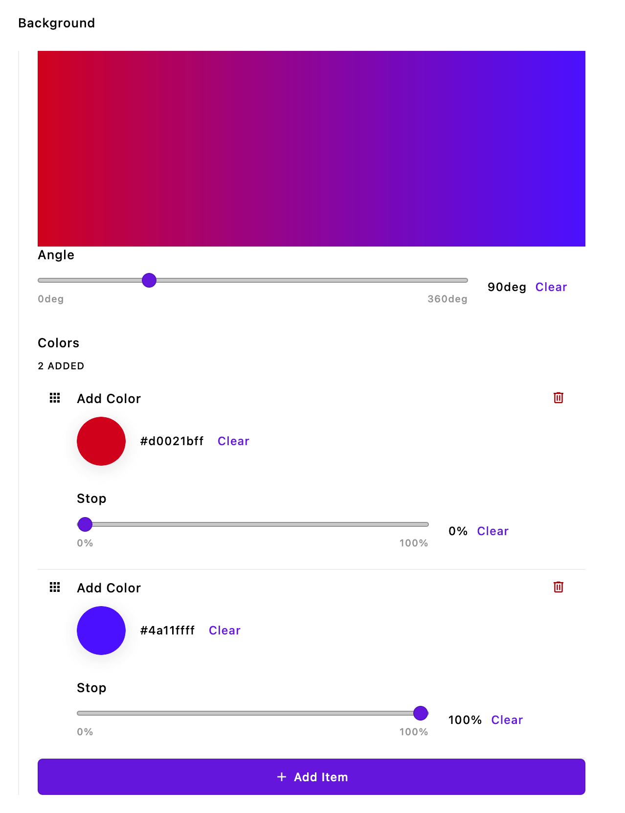 This custom schema field lets the editor create linear color gradients using any number of colors by taking advantage of an inline array schema field. The output from this could be used for the background of a hero or text with a gradient of color.
Just like with our first example, we need to create server-side code to handle registering the schema field type, plus sanitizing and storing the data in the database. We also need to create the browser-side Vue component to display our fields to the editor.
Creating the server-side code
module.exports = {
  init(self) {
    self.enableBrowserData();
    self.addColorGradientFieldType();
  },
  methods(self) {
    return {
      exposeSchema() {
        const schema = [
          {
            name: 'angle',
            label: 'Angle',
            type: 'range',
            min: 0,
            max: 360,
            unit: 'deg',
            def: 0
          },
          {
            name: 'colors',
            label: 'Colors',
            type: 'array',
            draggable: true,
            inline: true,
            schema: [
              {
                name: 'color',
                label: 'Add Color',
                type: 'color',
                def: '#4a11ffff'
              },
              {
                name: 'stop',
                label: 'Stop',
                type: 'range',
                min: 0,
                max: 100,
                unit: '%',
                def: 0
              }
            ]
          }
        ];
        return schema;
      },
      getBrowserData(req) {
        return {
          schema: self.exposeSchema()
        };
      },
      addColorGradientFieldType() {
        self.apos.schema.addFieldType({
          name: 'colorGradient',
          convert: self.convertInput,
          vueComponent: 'InputColorGradientField'
        });
      },
      async convertInput(req, field, data, object) {
        data = data[field.name];
        const schema = self.exposeSchema();
        const errors = [];
        const result = {};
        if (data == null || typeof data !== 'object' || Array.isArray(data)) {
          data = {};
        }
        try {
          await self.apos.schema.convert(req, schema, data, result);
        } catch (e) {
          for (const error of e) {
            errors.push({
              path: error.path,
              error: error.error
            });
          }
        }
        object[field.name] = result;
        if (errors.length) {
          throw errors;
        }
      }
    };
  }
};
For this example, we aren't going to explain every single line of the code. We are only going to point out major differences from the first example.
init(self) {
  self.enableBrowserData();
  self.addColorGradientFieldType();
},
Rather than adding this custom schema field for a specific piece, we are adding this field through a stand-alone module that doesn't extend any other module. This is a useful case for providing a schema field that may be used in several projects that don't have overlapping piece, widget, or page types.
Because it is a standalone module, within the init(self) method, we have to call the self.enableBrowserData() method to give access to the browser data. In addition, we are calling the function to add our custom field type, just like we did in the first example.
methods(self) {
  return {
    exposeSchema() {
      const schema = [
        {
          name: 'angle',
          label: 'Angle',
          type: 'range',
          min: 0,
          max: 360,
          unit: 'deg',
          def: 0
        },
        {
          name: 'colors',
          label: 'Colors',
          type: 'array',
          draggable: true,
          inline: true,
        👉🏻schema: [
            {
              name: 'color',
              label: 'Add Color',
              type: 'color',
              def: '#4a11ffff'
            },
            {
              name: 'stop',
              label: 'Stop',
              type: 'range',
              min: 0,
              max: 100,
              unit: '%',
              def: 0
            }
          ]
        }
      ];
      return schema;
    }
Once again, we are creating a function to return the schema we want to use. The overall schema should be an array of objects, with the name property included within the object. An additional change from our normal schema is that our array schema field should receive an array of schema field objects passed to the schema property. Remember that in a normal module schema the array field gets the schema through a fields property that receives an add property with an object of named objects. If you elect to use an object schema field you will need to make the same alteration.
getBrowserData(req) {
  return {
    schema: self.exposeSchema()
  };
},
Since we are in a stand-alone module with nothing to extend, we access getBrowserData(req) within the methods(self) section, rather than the extendMethods(self) section. Again, we are adding the schema to the browser data so that we can access it within the Vue component.
addColorGradientFieldType() {
  self.apos.schema.addFieldType({
    name: 'colorGradient',
    convert: self.convertInput,
    vueComponent: 'InputColorGradient'
  });
},
async convertInput(req, field, data, object) {
  data = data[field.name];
  const schema = self.exposeSchema();
  const errors = [];
  const result = {};
  if (data == null || typeof data !== 'object' || Array.isArray(data)) {
    data = {};
  }
  try {
    await self.apos.schema.convert(req, schema, data, result);
  } catch (e) {
    for (const error of e) {
      errors.push({
        path: error.path,
        error: error.error
      });
    }
  }
  object[field.name] = result;
  if (errors.length) {
    throw errors;
  }
}
The remainder of the methods(self) method is nearly identical to the first example. We add our custom field type using self.apos.schema.addFieldType() and the appropriate property values. Then we provide the convertInput() method to sanitize and store the data.
Creating the Vue component
<template>
  <AposInputWrapper
  :field="field"
  :error="null"
  :uid="uid"
  :modifiers="modifiers"
  >
    <template #body>
      <div class="apos-input-object">
        <div class="apos-input-wrapper">
          <div id="color-square" :style="{ background: gradient }" />
          <AposSchema
          :schema="gradientSchema"
          :trigger-validation="triggerValidation"
          :generation="generation"
          v-model="gradientSchemaInput">
          </AposSchema>
        </div>
      </div>
    </template>
  </AposInputWrapper>
</template>

<script>
import AposInputMixin from 'apostrophe/modules/@apostrophecms/schema/ui/apos/mixins/AposInputMixin';
import AposInputWrapper from 'apostrophe/modules/@apostrophecms/schema/ui/apos/components/AposInputWrapper.vue';
import AposSchema from 'apostrophe/modules/@apostrophecms/schema/ui/apos/components/AposSchema.vue';

export default {
  name: 'InputColorGradient',
  components: {
    AposInputWrapper,
    AposSchema
  },
  mixins: [ AposInputMixin ],
  props: {
    generation: {
      type: Number,
      required: false,
      default() {
        return null;
      }
    }
  },
  data() {
    const next = this.getNext();
    const gradientSchema = apos.modules['color-gradient'].schema;
    return {
      next,
      gradientSchemaInput: {
        data: next
      },
      gradientSchema: gradientSchema
    }
  },
  computed: {
    gradient() {
      if (this.next.colors && this.next.angle) {
        const gradientString = this.next.colors.reduce((acc, curr, i, colors) => {
          acc += `${curr.color} ${curr.stop}%`;
          if (i !== colors.length - 1) {
            acc += ', ';
          } else {
            acc += ')';
          }
          return acc;
        }, `linear-gradient(${this.next.angle}deg, `);
        return gradientString;
      }
    }
  },
  watch: {
    generation() {
      this.next = this.getNext();
      this.gradientSchemaInput = {
        data: this.next.value
      };
    },
    gradientSchemaInput: {
      deep: true,
      handler() {
        if (!this.gradientSchemaInput.hasErrors) {
          this.next = this.gradientSchemaInput.data;
        }
      }
    }
  },
  methods: {
    validate(value) {
      if (value == null) {
        value = '';
      }
      if (this.gradientSchemaInput.hasErrors) {
        return 'invalid';
      }
      return false;
    },
    getNext() {
      return this.value.data ? this.value.data : (this.field.def || {
        angle: 90,
        colors: [
          {
            color: '#d0021bff',
            stop: 0
          },
          {
            color: '#4a11ffff',
            stop: 100
          }
        ]
      });
    }
  }
};
</script>

<style lang="scss" scoped>
#color-square {
  height: 200px;
  width: 100%;
}

li {
  list-style: none;
}

.apos-input-object {
  border-left: 1px solid var(--a-base-9);
}

.apos-input-wrapper {
  margin: 20px 0 0 19px;
}

.apos-input-object ::v-deep .apos-schema .apos-field {
  margin-bottom: 30px;
}

.span-right {
  float: right;
}
</style>
For this example, we aren't going to explain every single line of the code. We are only going to point out major differences from the first example.
<template>
  <AposInputWrapper :field="field" :error="null" :uid="uid" :modifiers="modifiers">
    <template #body>
      <div class="apos-input-object">
        <div class="apos-input-wrapper">
          <div id="color-square" :style="{ background: gradient }" />
          <AposSchema :schema="gradientSchema" :trigger-validation="triggerValidation"
            :generation="generation" v-model="gradientSchemaInput">
          </AposSchema>
        </div>
      </div>
    </template>
  </AposInputWrapper>
</template>
For the template section of our custom schema field, the only notable difference is <div id="color-square" :style="{ background: gradient }" />. This line of markup adds the output of our selections above the input fields. It binds the style of that div to the computed gradient value.
The AposInputWrapper is taking the same props as were passed in the first example. The AposSchema is also receiving the same props, but custom field-specific :schema and v-model values supplied by the data() option.
import AposInputMixin from 'apostrophe/modules/@apostrophecms/schema/ui/apos/mixins/AposInputMixin';
import AposInputWrapper from 'apostrophe/modules/@apostrophecms/schema/ui/apos/components/AposInputWrapper.vue';
import AposSchema from 'apostrophe/modules/@apostrophecms/schema/ui/apos/components/AposSchema.vue';
The identical files for mixins and components are being imported. Again, if you are adding buttons, you can also elect to import that file from the @apostrophecms/ui module.
computed: {
  gradient() {
    if (this.next.colors && this.next.angle) {
      const gradientString = this.next.colors.reduce((acc, curr, i, colors) => {
        acc += `${curr.color} ${curr.stop}%`;
        if (i !== colors.length - 1) {
          acc += ', ';
        } else {
          acc += ')';
        }
        return acc;
      }, `linear-gradient(${this.next.angle}deg, `);
      return gradientString;
    }
  }
}
The gradient() method in the computed section gets the data for the colors array and angle field from this.next in order to construct a linear-gradient CSS field. This then populates the gradient display div in the template. Note that this method can easily be modified and added to the async components(self) method of any module to deliver this same string to a template.
getNext() {
  return this.value.data ? this.value.data : (this.field.def || {
    angle: 90,
    colors: [
      {
        color: '#d0021bff',
        stop: 0
      },
      {
        color: '#4a11ffff',
        stop: 100
      }
    ]
  });
}
As compared with the first example, the getNext() method has been slightly expanded. Instead of returning an empty array or the field default if the field hasn't been saved yet, it returns data with the angle field set to 90 and two colors with the color and stop values already set. This way, as soon as the editing modal is opened there is already a gradient displayed.
Summary
Creating a custom schema that utilizes existing fields in Apostrophe is fairly easy once you get the pattern.
On the server-side, you need to expose the schema for use with the getBrowserData() method. Then you register the field with self.apos.schema.addFieldType(). Finally, you provide a function to launder and store the returned data that is identical for any custom field.
On the browser-side, you need to provide a template with an AposInputWrapper component wrapping an AposSchema field. The inputs to each are virtually identical between any custom fields, except for the two state value inputs, :schema and v-model. Depending on the desired appearance, some changes in HTML markup might be necessary. The remainder of the script code is going to be essentially identical unless you add extra computed properties, as was the case with the second example.