 ApostropheCMS
@apostrophecms/admin-bar
Alias: apos.adminBar
Extends: @apostrophecms/module ℹ️
This module implements Apostrophe's admin bar at the top of the page. Any module can register a button (or more than one) for the bar by calling this module's add method. Buttons can also be grouped into dropdown menus and restricted to those with particular permissions. The @apostrophecms/piece-type module takes advantage of this module automatically.
Configuration options
Options are passed into the admin-bar module by creating a modules/@apostrophecms/admin-bar/index.js file in our project. Our project-specific configuration will merge gracefully with the defaults that come with the module.
| Property | Type | Description |
|---|---|---|
groups | Array | Adds one or more menu item group objects to be displayed in dropdown menus |
groups
The groups option takes an array of one or more objects that group several menu items together in the admin bar as a dropdown menu. Each of the groups objects requires a label and an array of menu items. The label will be used as the label displayed in the menu. The items array contains the names of the individual menu items you want to appear in the dropdown, entered in the order you want them to appear. Note: Menu names for piece-type items are the name of the piece-type, not the label. For core items, like 'Images', the name is prefixed - '@apostrophecms/image'.
Example
module.exports = {
 options: {
   groups: [
     {
       name: 'media',
       label: 'Media',
       items: [
         '@apostrophecms/image',
         '@apostrophecms/file',
         '@apostrophecms/image-tag',
         '@apostrophecms/file-tag'
       ]
     }
   ]
 }
};
This will result in grouping those four core modules into a single dropdown menu displayed as 'Media' on the menu bar. 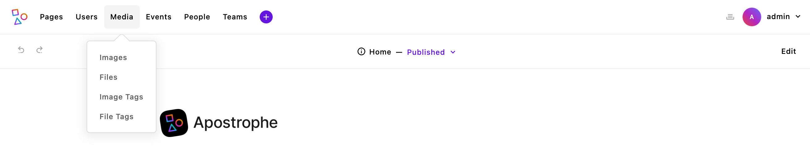
Featured methods
The following method belongs to this module and may be useful in project-level code. See the source code for all methods that belong to this module.
Because this module has an alias, you can call these from another module from the alias path. For example, self.apos.adminBar.add().
add(name, label, permission, options)
Add an item to the menu bar.
The name for the item must be unique within the menu bar to avoid conflicts. When the menu item is clicked, the name argument will be emitted on apos.bus as the value of an admin-menu-click event. If this item controls a specific modal, this will be caught by TheAposModals to display the correct modal. If this is the case, name should be the module name with a :editor or :manager suffix. For example, @apostrophecms/global:editor. A more complex example is contained within the @apostrophecms/login module.
Example
Code added to handle click events on the new button in the admin UI frontend:
export default () => {
  apos.bus.$on('admin-menu-click', async (item) => {
    // Make sure it is the button we care about, leave others to their own handlers
    if (item !== 'myCustomModule') {
      return;
    }
    // Custom code for button action
  });
}
INFO
Make sure to add this to the ui/apos/apps/ folder, or import it into a file located there. If you try to load this code by adding it to ui/src you will get an error in the console because the admin functions won't be available, yet.
The label will be the name displayed for the button on the menu bar.
permission is optional and takes an object with action and type properties. If no permissions are present, anyone can see the button. The action property dictates what type of action the button will perform. These include view, view-draft, edit, publish, upload-attachment, and delete. The type property matches the name of the module the button is managing. This type must have a registered manager.
options can take several properties that control the positioning and display of the new menu item.
| Property | Type | Description |
|---|---|---|
last | Boolean | If truthy, it will cause the button to be displayed at the end of the list. |
contextUtility | Boolean | If truthy, it will cause the button to be displayed in the tray of icons to the left of the page settings gear. |
icon | String | If contextUtility is true an icon name is required for display. |
toggle | Boolean | If truthy, the button will remain active until it is clicked a second time. |
tooltip | Object || String | Depending on the toggle value, a tooltip string or an object with activated and deactivated strings. |
user | Boolean | Adds the button alongside the "Log Out" button on the personal dropdown at the upper right. Should be reserved for items that manage personal settings. |
last
If the last property is set to ‘true’, the button will be displayed as the last item in the left list of buttons. Note: If more than one button has this property, the last one loaded will win.
contextUtility
If the contextUtility property is set to true, the button will be displayed as an icon in the tray of icons to the left of the page settings gear.
icon
For proper display when setting contextUtility to true, a property of icon set to the value of an existing icon must also be passed. More can be read about icons here. A list of the icons imported automatically by Apostrophe can be found in the ‘asset’ module in the ‘globalIcos.js’ file’ within the ‘lib’ folder.
toggle
The toggle property is used in conjunction with contextUtility. If it set to true then the button will toggle between active and inactive states. This allows the addition of different tooltip text depending on state.
tooltip
The tooltip property can take either a string or an object. If toggle is falsy, then the value of tooltip is a string to display on hover. If toggle is truthy, then tooltip takes an object with two arguments, activate and deactivate. Both properties accept string values with the former being displayed for the activated state and the later the deactivated state.