
Piece Creation
Howdy! 👋🏻
This tutorial is available in textual and video forms. Watch the videos and use this page to copy code into your project, or continue reading if you prefer. Of course, you can also do both!
Pieces are stand-alone documents containing structured content. This content can be material that is presented on a page, like a blog article, or a team roster. However, pieces can also be used for storing other types of data. For example, the @apostrophecms/user module extends the @apostrophecms/piece-type module and stores each project user as a piece. Because pieces are stand-alone documents, they can easily be retrieved from the database.
In this tutorial, we are going to create a review piece-type and accompanying pages for showing individual pieces, as well as all the pieces belonging to a specific category. This will introduce us to filtering and query builders. We will also dive further into localizing our user interface. Finally, we will create several additional widgets to allow the display of editor-specified pieces in page areas.
You can follow along and create the new modules for our project, or switch to the sec2-5-pieces branch of the GitHub repo.
Creating the review piece
We are once again going to use the CLI tool for the creation of our review-piece. We are also going to take advantage of an additional flag, --page, to create an optional set of piece-type-pages for the display of our pieces.
apos add piece review --page⚠️ Remember to add both of the newly created modules to the
app.jsfile.
The piece-type module
We will start by opening the modules/review/index.js file that extends the @apostrophecms/piece-type core module. Add the following code:
module.exports = {
  // extending a core module creates a new instance of that module type
  // with a new name, but all the same functions
  extend: '@apostrophecms/piece-type',
  options: {
    label: 'Review',
    pluralLabel: 'Reviews',
    i18n: {
      browser: true
    }
  },
  fields: {
    add: {
      author: {
        type: 'string',
        label: 'Author',
        required: true
      },
      featuredImage: {
        type: 'area',
        label: 'Featured Image',
        max: 1,
        options: {
          widgets: {
            '@apostrophecms/image': {}
          }
        }
      },
      content: {
        type: 'area',
        label: 'Content',
        options: {
          widgets: {
            '@apostrophecms/rich-text': {},
            '@apostrophecms/image': {},
            rating: {}
          }
        }
      },
      category: {
        type: 'select',
        label: 'Category',
        required: true,
        choices: [
          {
            label: 'Vehicle',
            value: 'vehicle'
          },
          {
            label: 'Home & Garden',
            value: 'home-garden'
          },
          {
            label: 'Appliances',
            value: 'appliances'
          },
          {
            label: 'Electronics',
            value: 'electronics'
          },
          {
            label: 'Toys',
            value: 'toys'
          }
        ]
      },
      isFeatured: {
        type: 'boolean',
        label: 'Featured',
        def: false
      }
    },
    group: {
      content: {
        label: 'Content',
        fields: [ 'title', 'author', 'featuredImage', 'content' ]
      },
      meta: {
        label: 'Meta',
        fields: [ 'category', 'isFeatured' ]
      }
    }
  },
  filters: {
    add: {
      isFeatured: {
        label: 'featured'
      },
      category: {
        label: 'category'
      }
    }
  },
  columns: {
    add: {
      category: {
        label: 'Category'
      }
    }
  }
};
The fields object of this code adds five input schema fields and groups them into two tabs, content and meta. The three fields on the content tab are what you would expect for a review article. First the author of the piece, next, a single image from the article that can be featured in any markup as featuredImage, and finally the actual content, with the rich-text and image widgets, along with our custom ratings widget for the author to rate the product.
INFO
The featuredImage has an area schema field type that we are adding an image-widget into for the editor to add a single image. In this case it might have been preferable to use a relationship, instead.
_featuredImage: {
  label: 'Image',
  type: 'relationship',
  withType: '@apostrophecms/image',
  max: 1
}
In the meta tab, we are adding two fields. First, we are assigning the article to a review-type category. We will use this for selective display and filtering of the reviews onto individual index pages. Second, we are adding the ability for the user to toggle whether the review should be featured with a boolean field, isFeatured. We will also use this to filter the reviews that we display in the browser.
Adding filters to the piece manager
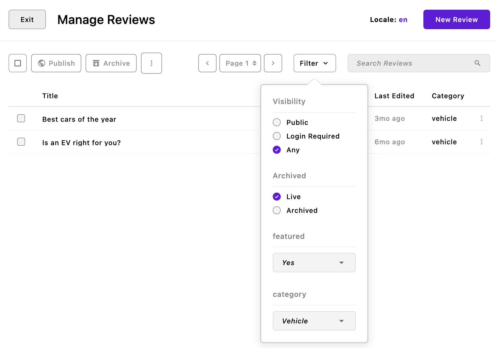
Following the fields object, there is a filters object. The filters object can be configured with subsections: add and remove. This configuration can either be added as a static object, as in this example, or a function that takes self and options and returns an object. Filters must correspond to an existing fields name or custom query builder on the piece type. We will cover custom queries in the Adding Extensions tutorial.
filters: {
  add: {
    isFeatured: {
      label: 'featured'
    },
    category: {
      label: 'category'
    }
  }
}
This block of code introduces filters for the isFeatured and category fields, enabling the user to display or exclude featured pieces and reviews from particular categories, respectively. We will return to how we can use the isFeatured filter in the section on creating review pages.
Piece manager columns
columns: {
  add: {
    category: {
      label: 'Category'
    },
  }
}
By default, the piece manager displays the piece title and the date the piece was last edited. Like the filters object, the columns object allows for the addition or removal of columns based on the schema fields of the module. In this case we are electing to display the category of the review to the right of the 'Last Edited' column in the piece manager.
Localizing the UI
 In the
 options object, we have the standard label and pluralLable properties, but we have a new property i18n. This option allows us to localize the review piece admin UI to different languages by passing browser: true. It is slightly different from the localization that we introduced when creating our views/fragments/topbar.html fragment. There, we were adding localization to our template, not the interface the author is using. In the template, our localized strings were within Nunjucks tags and passed to the __t() helper. In this case, we don't have to do anything extra. Adding the i18n option will let Apostrophe know that we want to translate any label where we have supplied a corresponding translation string.
Just like with the topbar, we need to create a module-level folder for our translation strings. Create a modules/review/i18n folder and add a file named en.json inside. Into that file, we are going to add all the labels from each of the schema fields, including the labels for the choices in the select field.
{
  "Review": "Review",
  "Reviews": "Reviews",
  "Author": "Author",
  "Featured Image": "Featured Image",
  "Content": "Content",
  "Category": "Category",
  "Vehicle": "Vehicle",
  "Home-garden": "Home & Garden",
  "Appliances": "Appliances",
  "Electronics": "Electronics",
  "Toys": "Toys",
  "Featured": "Featured?",
  "Meta": "Meta",
  "All": "All"
}
In this case, since we are localizing the strings within a single project, we aren't using a namespace. If we were intending on distributing this module to multiple projects as a package, we would need to make a few changes to our modules/review/index.js file. First, we would need to prefix all the label strings to be translated with the namespace. For example, label: 'review:Author'. Second, we would need to move the i18n property out of the options object to be a top-level property. That property would then receive a namespace-named object with the browser: true property:
i18n: {
  review: {
    browser: true
  }
}
We also need a translations file for our de locale, so create a de.json file in the same location and add:
{
  "Review": "Bewertungs",
  "Reviews": "Bewertungen",
  "Author": "Autor",
  "Featured Image": "Vorgestelltes Bild",
  "Content": "Inhalt",
  "Category": "Kategorie",
  "Vehicle": "Fahrzeug",
  "Home & Garden": "Haus & Garten",
  "Home-garden": "Haus & Garten",
  "Appliances": "Geräte",
  "Electronics": "Elektronik",
  "Toys": "Spielzeug",
  "Featured": "Vorgestellt?",
  "Meta": "Meta",
  "All": "Alle"
}
Adding the review pages
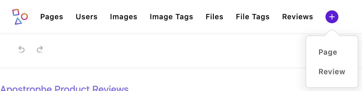
We now have a way to create review pieces. If we were to spin up our project we would see a new item 'Reviews' in the admin bar. Clicking on the plus icon we would get a dropdown that will let us quickly add a new review piece by creating the piece and opening the edit modal without having to open the piece manager first. As we will revisit in the admin bar configuration tutorial, you can configure this bar to group items or prevent them from appearing in the quick create menu.
While we can now create new review pieces, they won't be displayed anywhere in our site. One way that we can display our pieces is to use a piece-page-type. Our CLI command has already created a modules/review-page folder for us. Opening the index.js file, we can see the normal extend and options properties. Because this folder is named review-page, Apostrophe automatically knows that these pages should be associated with the review piece-type. If we wanted to give this module a different name, we would have to add the pieceModuleName property to the options object with a value of review. We will alter this file after we create our index.html page.
⚠️ At this point, although the
review-pagemodule has been created and we added it to theapp.jsfile, none of the page templates that we are constructing would be available for a user to select. We also need to add this module to themodules/@apostrophecms/page/index.jsfile. Open that file and add the following object into thetypesarray:
{
  name: 'review-page',
  label: 'Category Pages'
}
The index.html page
The index.html page is located in the piece-page-type module views folder. This page is meant to display a listing of pieces and takes markup much like our homepage. You can elect to use the same template as the homepage, or create an entirely new one. In the case of our project, we are going to mimic the look of our homepage with the same topbar, footer, and eventually, navigation fragments. Open the modules/review-page/views/index.html file and add the following:
<!-- Pages should extend the layout to get the header and footer -->
{% extends "layout.html" %}

<!-- This loads in a macro to help with pagination -->
{% import '@apostrophecms/pager:macros.html' as pager with context %}

<!-- This grabs the current URL for adding query parameters to filter -->
{% set currentPath = data.page._url %}

<!-- This is the main content area -->
{% block main %}
  <div class="container ms-5 me-5">
    <div class="d-flex justify-content-between align-items-center mb-5">
      <h1 class="custom-underline display-6 ps-2 mb-5">Reviews</h1>
      <div>
        {% if data.query.isFeatured === 'true' %}
          <a href="{{ currentPath | build({isFeatured: null}) }}" class="btn btn-secondary">Show All</a>
        {% else %}
          <a href="{{ currentPath | build({isFeatured: true}) }}" class="btn btn-primary">Show Featured Only</a>
        {% endif %}
      </div>
    </div>
    <div class="row g-3">
      <!-- This loops through all of the review pieces and displays them -->
      {% for review in data.pieces %}

        <!-- Use a helper to get the image -->
        <!-- Use the Nunjucks `set` to create a variable -->
        {% set image = apos.image.first(review.featuredImage) %}

        <!-- Even though the featuredImage field is required, it's possible that the image has been deleted. So we need to check for that. -->
        {% if image %}
          {% set imageUrl = apos.attachment.url(image, {size: 'one-sixth' }) %}
        {% else %}
          <!-- Instead of an else you could choose to skip displaying an image. -->
          {% set imageUrl = 'https://picsum.photos/200' %}
        {% endif %}

        <!-- This is just to show how to get image details without using the helper -->
        {% set altText = review.featuredImage.items[0]._image[0].alt %}

        <div class="review col-md-4">
          <div class="review__image">
            <img src="{{ imageUrl }}" alt="{{ altText }}">
          </div>
          <div class="review__content">
            {% if review.isFeatured %}
              <span class="review__featured">Featured</span>
            {% endif %}
            <h2 class="review__title"><a href="{{ review._url }}" class=" text-decoration-none text-dark">{{ review.title }}</h2></a>
            <p class="review__author">Authored by: {{ review.author }}</p>
          </div>
        </div>

      {% endfor %}
    </div>

  <!-- This renders the page navigation -->
{% if data.totalPages !== 1 %}
  <div class="row justify-content-center mb-5">
    <div class="col-md-4 align-self-center bg-info border border-dark border-3 rounded">
      <p class="fs-3">Review Navigation</p>
    {{ pager.render({
      page: data.currentPage,
      total: data.totalPages,
      shown: 5,
      class: 'fs-3 ms-5'
      }, data.url) }}
    </div>
  </div>
{% endif %}
</div>
{% endblock %}
Walking through the code, we start with
{% extends "layout.html" %}This allows our page to use the same head, topbar, and footer as the home page.
{% import '@apostrophecms/pager:macros.html' as pager with context %}
// ...
  <!-- This renders the page navigation -->
{% if data.totalPages !== 1 %}
  <div class="row justify-content-center mb-5">
    <div class="col-md-4 align-self-center bg-info border border-dark border-3 rounded">
      <p class="fs-3">Review Navigation</p>
    {{ pager.render({
      page: data.currentPage,
      total: data.totalPages,
      shown: 5,
      class: 'fs-3 ms-5'
      }, data.url) }}
    </div>
  </div>
{% endif %}
This first line of code imports markup from the @apostrophecms/pager module. This markup contains several Nunjucks macros, which are a little like fragments that we worked with when creating our homepage. These macros are helpers that parse the number of pieces that we want to display on the page, deliver them in customizable groups, and create a breadcrumb trail for navigating through the groups.
The final block below the main content adds in the markup for our navigation breadcrumbs.
{{ pager.render({
  page: data.currentPage,
  total: data.totalPages,
  shown: 5,
  class: 'fs-3 ms-5'
}, data.url) }}
This code calls the imported macro and passes in several items from the data object that is available on any piece-page-type index page. The currentPage contains what page of results is currently being shown starting with 1. The totalPages gives the total number of pages that there are given the current group size. The optional shown option defines the maximum number of pages that should be displayed in the pager breadcrumb display at one time. If the total number of pages exceeds this the macro will insert ellipses either at the beginning or end to indicate that there are more pages available. The optional class property will add these classes to the wrapper around the breadcrumbs. Finally, the macro needs the URL of the page in order to correctly construct the links. All of this data is available for you to create your own navigation macros.
<!-- This grabs the current URL for adding query parameters to filter -->
{% set currentPath = data.page._url %}
<!-- This is the main content area -->
{% block main %}
  <div class="container ms-5 me-5">
    <div class="d-flex justify-content-between align-items-center mb-5">
      <h1 class="custom-underline display-6 ps-2 mb-5">Reviews</h1>
      <div>
        {% if data.query.isFeatured === 'true' %}
          <a href="{{ currentPath | build({isFeatured: null}) }}" class="btn btn-secondary">Show All</a>
        {% else %}
          <a href="{{ currentPath | build({isFeatured: true}) }}" class="btn btn-primary">Show Featured Only</a>
        {% endif %}
      </div>
    </div>
Returning to the main markup of the page, after adding a tag to add our markup to the main block, we open a Bootstrap container. Within that container we add a wrapper div containing the main heading for the page and another div. Within that wrapper div, we apply Bootstrap classes for flexbox layout (d-flex), justifying the content to be evenly spaced between the start and the end (justify-content-between), and vertically aligning items in the center (align-items-center). We also add a margin-bottom (mb-5) for spacing.
Inside this wrapper div, there are two main elements:
The first is an
<h1>tag that serves as the main heading for the page, labeled 'Reviews'. It uses the Bootstrap classdisplay-6for styling, additional padding (ps-2), and a margin-bottom (mb-5). A custom underline is also applied with thecustom-underlineclass.The second is another
divthat contains conditional logic to render a button. This is done using the{% if %}and{% endif %}tags, which are part of the template engine.
<!-- This grabs the current URL for adding query parameters to filter -->
{% set currentPath = data.page._url %}
Above the main block we are getting the current URL of the page, including any query parameters, using data.page._url. If that URL has a query parameter of isFeatured=true, a 'Show All' button is displayed with a secondary Bootstrap styling (btn btn-secondary). The URL for the button is dynamically generated by passing the page URL to the Apostrophe template filter build - {{ currentPath | build({isFeatured: null}) }}. This will remove the isFeatured query parameter by setting it to null. If the query parameter isn't present in the current page URL, a 'Show Featured Only' button with primary Bootstrap styling (btn btn-primary) will be added. The URL for this button will be constructed with the same filter, but the isFeatured=true query parameter will be added to the current URL.
Please note that this is completely independent of the fact that we are using isFeatured as a filter for the piece manager. Most schema fields have filters already available. The values of the fields will get added to fields in the database document. So for example, we could add ?author=name and the page would only display review pieces by that author. For fields that contain strings, individual words are added to the document search fields. So for example, a piece titled "Best Bed Buys for 2023" would be returned by adding a query parameter of ?title=bed to the URL. However, a custom filter is needed if you want to filter based on a derived value, like the year of publication when the date field also contains the month and day. We will cover this in the Adding extensions tutorial.
We aren't going to step through the remainder of the main content markup of the page in detail since it uses familiar concepts from past tutorials.
In brief, we set up a loop to go through all the piece objects available in the data.pieces array. For each, we extract a featured image, a link to the individual piece page, the piece title, and the piece author. Note that we are getting the link as _url. The underscore in front indicates that it is a property that is computed, not retrieved from the database. In this case, this is because pieces can be assigned to different parent pages and these links need to be computed dynamically at the time of rendering. We will cover assigning pieces to different pages in the next sections.
Now that we have our index page created, we can reopen our modules/review-page/index.js file and update our options object to add perPage: 9 which will cause the review pieces to be displayed in groups of 9 per page. At this point, you can go ahead and spin the site up and create some review pieces. You can then add a new page, selecting Category Pages for the page type from the dropdown on the right.
Creating the show.html page
We now have a page to display all of our reviews, but we still need a template for showing an individual piece. Open the modules/review-page/views/show.html file and add the following code:
<!--
  This page is for displaying individual review pieces.
-->

<!-- Pages should extend the layout to get the header and footer -->
{% extends "layout.html" %}

{% set review = data.piece %}

<!-- Use a helper to get the image -->
<!-- Use the Nunjucks `set` to create a variable -->
{% set image = apos.image.first(review.featuredImage) %}
<!-- Even though the featuredImage field is required, it's possible that the image
  has been deleted. So we need to check for that. -->
{% if image %}
  {% set imageUrl = apos.attachment.url(image, {size: 'full'}) %}
  {% set srcset = apos.image.srcset(image) %}
{% else %}
  <!-- Instead of an else you could choose to skip displaying an image. -->
  {% set imageUrl = 'https://picsum.photos/200' %}
{% endif %}

<!-- This is just to show how to get image details without using the helper -->
{% set altText = review.featuredImage.items[0]._image[0].alt %}

<!-- Take advantage of `{{apos.log()}}` to see what data is available -->

<!-- This is the main content area -->
{% block main %}
  <div class="container">
    <div class="row">
      <div class="col-md-12">
        <h1 class="ms-5 custom-underline display-6 ps-2 mb-5">Review</h1>
      </div>
      <div class="review col-md-12">
        <div class="review__image text-center">
          <img srcset="{{srcset}}" src="{{ imageUrl }}" class="img-fluid" alt="{{ altText }}">
          {% if review.isFeatured %}
            <span class="review__featured fs-4 carousel-caption">Featured Article </span>
          {% endif %}
        </div>
        <div class="review__content">
          <h2 class="review__title text-center display-1 my-3">{{ review.title }}</h2>
        </div>
      </div>
    </div>
    <div class="row justify-content-md-center">
      <div class="col-md-8">
          <p class="review__author fs-5 mb-3">Written by: {{ review.author }}</p>
        {% area review, 'content'%}
      </div>
    </div>
  </div>
{% endblock %}
The markup here is straightforward. One thing to note is that the markup is being populated by items from data.piece whereas the index.html file was using data.pieces. We are also making use of a helper from the @apostrophecms/image module, apos.image.srcset(). This will return a string containing a comma-separated list of each of the image sizes paired with a view width. This can help page loading speed by allowing the browser to pick the optimal image size to load.
Displaying review pieces by category
Looking back at the schema fields of our review piece, we added a select field to be able to add a category. For example, reviews of vehicles or appliances. We want to give our site visitors the ability to look at just the reviews within a certain category. Luckily, Apostrophe provides an easy way to accomplish this. The @apostrophecms/piece-page-type module provides two methods, filterByIndexPage() and chooseParentPage(), that we can extend to allow us to assign specific pieces to certain pages.
We will start by adding a select to our review-page/index.js file that will allow the editor to select what types of pieces should be displayed on the page. Open that file and add this code after the options object, replacing the existing code:
fields: {
  add: {
    displayCategory: {
      type: 'select',
      label: 'Display Category',
      choices: 'addCategoryChoices()'
    }
  },
  group: {
    basics: {
      label: 'Basics',
      fields: [ 'displayCategory' ]
    }
  }
}
This code will create a single new schema field that the author can use to select the page category. We used a similar schema field in creating our review piece module. The big difference is that here we are dynamically populating the choices. This is a powerful way to ensure that the range of choices stays current, even if, for example, there is a new category of reviews added. In this case, we are passing the choices property a string and not the actual method. This string refers to a method we can either import or define within this module and should always end with () to indicate that it is referring to a method.
After the fields, add this code:
methods(self) {
  return {
    async addCategoryChoices(req) {
      const allReviews = await self.apos.modules.review.find(req)
        .project({
          category: 1
        })
        .toArray();
      const uniqueCategories = [ ...new Set(allReviews.map(review => review.category)) ];
      return [
        {
          label: 'All',
          value: 'all'
        },
        ...uniqueCategories.map(category => ({
          label: category.charAt(0).toUpperCase() + category.slice(1),
          value: category
        }))
      ];
    }
  };
}
We are taking advantage of the methods(self) configuration function that is part of every Apostrophe module. This allows us to define JavaScript functions to be used in the same module or to be called by any other custom module. This method always returns an object of functions. In this case, it is returning a single async function, addCategoryChoices(req).
Querying the database
While it is possible to directly query the database, Apostrophe provides a way to make a wide variety of queries without knowing advanced MongoDB syntax. Further, queries using the Apostrophe API are secure and will only return content the active website user is allowed to access. Both page and piece modules have access to a find() method that initiates a database query. This method takes the req object and optional criteria and options.
const allReviews = await self.apos.modules.review.find(req)
  .project({
    category: 1
  })
  .toArray();
The allReviews variable uses the find() method, passing it the request object from the index page. From within the review module, we could use await self.find(req) because the method would be restricted to only review pieces. In this case, we are querying the review pieces from the review-page module, so we need to reference the find() method of that review module using self.apos.modules.review.find(req). This query will initialize a query to return all the review pieces. These results are next filtered and modified by several "query builders". These query builders can alternatively be passed as an object to the options argument of the find() method, instead of chaining them, as is shown here.
The first query builder we are adding is project(). This query builder limits the data that is returned from our find operation and takes an object with document properties to be included as keys, and the value of each set to 1 or true. You can also use project() to eliminate fields by setting the value to 0 or false, but you can not provide a project() with both inclusion and exclusion criteria. In this case, we want to provide our content editor with a list of all the review categories. We don't need to supply the titles or authors, so we limit the amount of data that needs to be passed. Some other common query builders are sort() and limit(). You can read more about them in the documentation.
Finally, we pass our query to the toArray() query method. The other common query method is toObject(). Both these methods take the criteria and refinements added by the query builders and add logic to tell the database how we want the data returned, as an array of objects or a single object, respectively.
const uniqueCategories = [ ...new Set(allReviews.map(review => review.category)) ];Our next constant definition takes the returned query array, extracts all the categories, removes duplicates, and assigns the array of unique categories to uniqueCategories.
return [
  {
    label: 'All',
    value: 'all'
  },
  ...uniqueCategories.map(category => ({
    label: category.charAt(0).toUpperCase() + category.slice(1),
    value: category
  }))
];
Finally, we are returning an array of choices to the select schema field. We are adding an initial choice of all so that the editor can choose to have a page where the results aren't filtered according to the review category. The first letter of each category is converted into upper-case so that the labels match our translation strings.
Filtering the index page
Now that we have a way for the user to determine what review pieces they want to be displayed on the page, we need to extend the filterByIndexPage() method. In this case, we are going to use the extendMethods(self) configuration method. This allows a method to essentially improve, rather than replace, a method defined in the base module. Like the methods(self) configuration method, it should return an object of methods. Each method it returns should take the same arguments as the original, plus the _super argument.
Add this code after the methods(self), making sure to add a comma to separate the two methods:
extendMethods(self) {
  return {
    filterByIndexPage(_super, query, page) {
      // if the page has a category, add it to the query
      // if the page category is `all`, don't modify the query and return all pieces
      if (page.displayCategory && page.displayCategory !== 'all') {
        query.category(page.displayCategory);
      }
      // return the query
      return query;
    };
  }
}
This original filterByIndexPage() method takes the query and page arguments. Since we are extending the method, we are also adding the _super argument. Inside the function we check to make sure the content creator has selected a category and that it isn't all. If so, we take advantage of the fact that Apostrophe automatically adds query builders for most schema fields. In this case, adding a query builder that checks that the value of the review piece category schema field for each piece is equal to the category that the editor selected.
Connecting the individual pieces to the correct parent
We have now solved one side of our routing equation. Each new review page that the user creates can be set to display pieces of a selected category. However, once we click on the link to take us to the individual reviews, that review show.html page won't have information about the parent page. We need to extend the chooseParentPage() method to assign the correct one.
After the filterByIndexPage() method we just added, add the following code (making sure to separate our methods with a comma):
chooseParentPage(_super, pages, piece) {
  // if the piece has a category and there is more than one page, assign the correct one
  if (piece.category && pages.length > 1) {
    // grab the piece.category and assign it to a variable
    // set to `all` if it's not a string
    const pieceCategory = typeof piece.category === 'string' ? piece.category : 'all';
    // find the page with the correct category
    // if we didn't find a page with the correct category
    // use the `chooseParentPage` method of the parent module
    // to assign the fallback page
    return pages.find((page) => page.displayCategory === pieceCategory) || _super(pages, piece);
  }
  // if only a single page, use the default behavior
  return _super(pages, piece);
}
Again, the original method took two arguments that we are prefacing with the _super argument. The pages argument is going to contain an array of all the pages that are in the database that are the review-page page type. The piece argument is going to be the individual piece that is being requested for display.
First, we are checking that the category is set for the piece that is being requested and that there is more than one review-page. If not, then we return the results of the original method, using _super(pages, piece). Otherwise, we set the pieceCategory constant to either the value the author selected or all if the field doesn't have a string value. This is then used with the JavaScript Array.prototype.find(), not the Apostrophe query initiator, to select a page from the pages array. As fallback, if no page has been created with a matching category it will fall back to the parental method to select the correct page.
INFO
This chooseParentPage() extended method is relatively simple. We could have elected to add it as a method instead, passing data.pages[0] back instead of the results of _super(pages, piece).
At this point, you can spin the project up and create a new page for every category, plus another for 'all' to display all the pieces, or if you haven't done so yet, you can import the database from the final project (see the repository README to learn how to accomplish this). In the next tutorial, we will add site navigation to link these pages to the homepage. Next, we are going to look at two further ways to display pieces on our pages.
Creating a piece widget
So far, we can only display pieces on a dedicated page, but obviously, we also want to be able to display pieces on other pages throughout our site. One way this can be accomplished is through the creation of a widget that can be added to any area. We are going to create two different widgets, a simple one to display any review article, and a more complex one that allows the content creator to select from either a featured review or the latest review.
Adding the all reviews widget
 We won't be using this widget in our project, but it will be useful to build in order to introduce a new schema field and how it is used within a template. After construction, we will add it to the
 default-page area to see what it looks like. As with most of our custom modules, we will use the CLI tool to create our widget.
apos add widget all-reviewsThis will create a modules/all-reviews-widget folder and populate it with an index.js file and a views folder with a widget.html file.
⚠️ Remember to add the new module to the
app.jsfile
Creating the schema
Open the index.js file and add the following code:
module.exports = {
  extend: '@apostrophecms/widget-type',
  options: {
    label: 'All Reviews Widget'
  },
  fields: {
    add: {
      _selectedReview: {
        type: 'relationship',
        label: 'Review to display',
        withType: 'review',
        required: true,
        max: 1,
        builders: {
          project: {
            title: 1,
            author: 1,
            _url: 1
          }
        },
        fields: {
          add: {
            recommender: {
              type: 'string',
              label: 'Recommender',
              required: true
            },
            recommendation: {
              type: 'string',
              label: 'Recommendation',
              required: true,
              textarea: true,
              max: 50
            }
          },
          group: {
            extras: {
              label: 'Extras',
              fields: [ 'recommender', 'recommendation' ]
            }
          }
        }
      }
    },
    group: {
      basics: {
        label: 'Basics',
        fields: [ '_selectedReview' ]
      }
    }
  }
};
For this code, we are using a new schema field, the relationship field. Note that the name of the field is prefixed with an underscore, _selectedReview. As we covered earlier in the tutorial, this means that the data returned by this field is computed at the time of render. The withType property identifies the Apostrophe doc type that is connected to the field. If we wanted to connect to a page, we would use withType: '@apostrophecms/any-page-type'.
In addition to the required and max properties, this relationship has two additional optional properties, builders and fields.
The builders property takes an object containing a project object that can limit the data returned, exactly like the query builders covered previously. In this case, only the title, author, and _url are being returned.
The fields property works like the top-level property of the same name. In this code, we are adding two additional fields to collect a recommender's name and recommendation. As with the top-level property, the group property is being used to group the fields on the extras tab. For the recommendation we are using a string type input field, but passing it the optional textarea boolean property to convert it into a textarea input, and a max property to limit the number of characters that can be added.
You can read more about the relationship field, like allowing nested relationships with withRelationships, as well as reverseRelationship fields and using ifOnlyOne to limit data in the documentation.
Adding the widget markup
Open the modules/all-reviews-widget/views/widget.html file and add the following code:
<section class="bg-light pb-5 pt-5">
  <div class="container pb-5 pt-5">
    <div class="align-items-center row">
      <!-- always check to make sure the review still exists and has been added -->
      {% if data.widget._selectedReview.length > 0 %}
        {% set review = data.widget._selectedReview[0] %}
        <div class="col-lg">
          <h2 class="h6 text-primary text-uppercase">Recommended</h2>
          <p class="text-primary ms-4">{{review._fields.recommender}} says: {{review._fields.recommendation}}
          </p>
          <h3 class="fw-bold h2 mb-3">{{review.title}}</h3>
          <p class="fw-light h4 ms-4">BY: {{ review.author }}</p>
        </div>
        <div class="col-lg-auto">
          <a href="{{ review._url }}" class="btn btn-primary text-uppercase">Read More</a>
        </div>
      {% endif %}
    </div>
  </div>
</section>
We are using an if within Nunjucks tags to make sure that the content creator added the review and it hasn't been archived by checking the data.widget._selectedReview value. A relationship field will return an array with all the selected documents, so that array should have a length longer than 0 if at least one review has been added. Next, since we are only expecting a single document in the array, we are setting the review variable to the first item in the array.
Within that review, we can access the additional fields through the _fields property. This allows us to add the recommender name and recommendation. The rest of the data coming from the review is accessed through the schema names directly.
Finally, add this widget to the default-page by adding it to the end of the widgets object. You can then spin the project up, add a new default page and add the new widget in the main area to see what it looks like.
Creating the review widget
We are going to create an additional widget that will allow the editor to select and display featured or recently published pieces. We are also going to give the content creator the ability to select the number of reviews to add, and a choice of whether to add an image. Again, we will start by using the CLI tool to create our widget.
apos add widget review⚠️ Don't forget to add your new module to the
app.jsfile.
Adding the schema
Open the newly created modules/review-widget/index.js file and add the following code:
module.exports = {
extend: '@apostrophecms/widget-type',
options: {
label: 'Review Widget',
},
fields: {
add: {
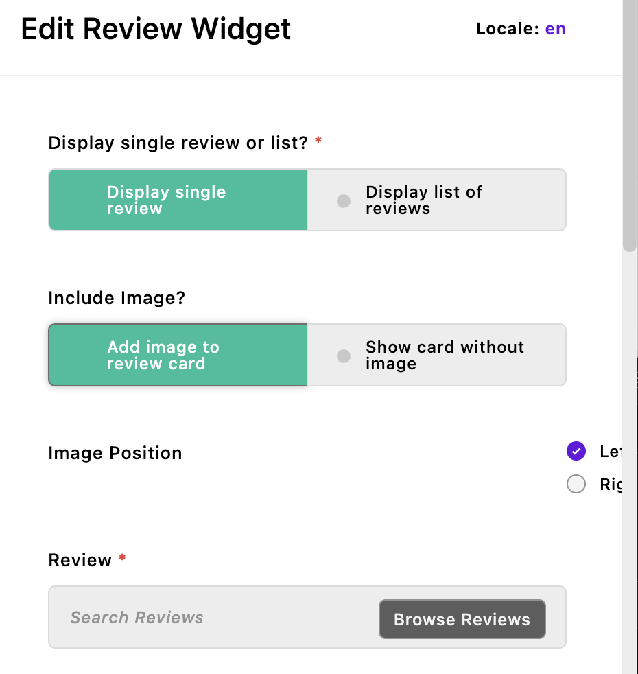
displaySingle: {
type: 'boolean',
label: 'Display single review or list?',
required: true,
def: true,
toggle: {
true: 'Display single review',
false: 'Display list of reviews'
}
},
includeImage: {
type: 'boolean',
label: 'Include Image?',
toggle: {
true: 'Add image to review card',
false: 'Show card without image'
},
if: {
displaySingle: true
}
},
imagePosition: {
type: 'radio',
label: 'Image Position',
def: 'left',
choices: [
{
label: 'Left',
value: 'left'
},
{
label: 'Right',
value: 'right'
}
],
if: {
includeImage: true
}
},
_review: {
type: 'relationship',
withType: 'review',
required: true,
if: {
displaySingle: true
}
},
category: {
type: 'select',
label: 'Category',
required: true,
def: 'all',
choices: [
{
label: 'All',
value: 'all'
},
{
label: 'vehicle',
value: 'vehicle'
},
{
label: 'Home & Garden',
value: 'home-garden'
},
{
label: 'Appliances',
value: 'appliances'
},
{
label: 'Electronics',
value: 'electronics'
},
{
label: 'Toys',
value: 'toys'
}
],
if: {
displaySingle: false
}
},
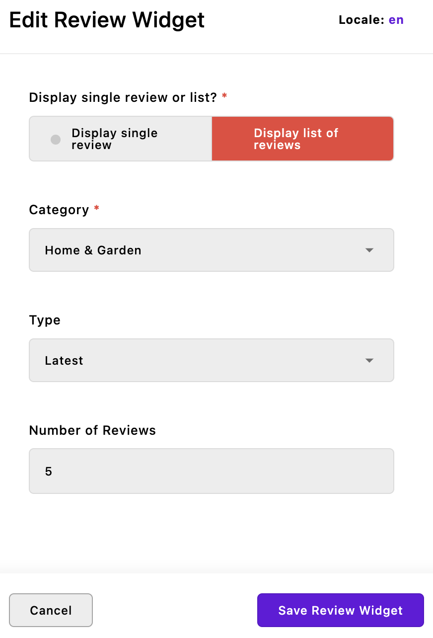
time: {
type: 'select',
label: 'Type',
choices: [
{
label: 'Latest',
value: 'latest'
},
{
label: 'Featured',
value: 'featured'
}
],
if: {
displaySingle: false
}
},
number: {
type: 'integer',
label: 'Number of Reviews',
min: 1,
max: 10,
if: {
displaySingle: false
}
}
}
},
components(self) {
return {
async returnReviews(req, data) {
const criteria = (data.category === 'all') ? {} : { category: data.category };
if (data.time === 'featured') {
criteria.isFeatured = true;
}
const limit = data.number;
/* Because we are not in the `review` module, we need to use `self.apos.modules.review` to access that module. To search the same module, we would use `self.find()`. We only need the 'title', '_url', and 'category' so we are limiting the returned data with `project({})`.
*/
const reviews = await self.apos.modules.review.find(req, criteria)
.project({
title: 1,
_url: 1,
category: 1
})
.sort({ createdAt: -1 })
.limit(limit)
.toArray();
return {
reviews: reviews
};
}
};
}
};The fields object should look fairly familiar. We are using two new field types, boolean and radio. The boolean field returns either true or false. For both, we are adding the optional toggle property. Without the toggle property, the boolean input field places two buttons side-by-side labeled Yes and No. The toggle property adds the string values added for the true and false values to those buttons. It also changes the selected appearance from a colored dot to a change in the background color.
In this code, whether the includeImage field is added to the schema is controlled by the value of the displaySingle field. Note that even though we have added new labels to the buttons, the returned values are still true and false. If displaySingle is false, the final data object won't include the field.
The radio field allows for the selection of a single choice out of a list of choices. The decision to use a radio versus a select field usually comes down to the number of choices, since the choices in a radio field will always be displayed. Otherwise, these two types of field can be used interchangeably, including populating the choices dynamically.
We are going to ignore the final section of this code that adds a component until we add markup to the views/widget.html file.
Create the markup
Open the modules/review-widget/views/widget.html file and add the following code:
{% set data = data.widget %}
{% if data.displaySingle === true %}
  {% set review = data._review[0] %}
  {% if data.includeImage === true %}
    {% set image = apos.image.first(review.featuredImage) %}
    {% if image %}
      {% set imageUrl = apos.attachment.url(image, {size: 'one-half' }) %}
    {% else %}
      {% set imageUrl = 'https://picsum.photos/200' %}
    {% endif %}
    {% set imageBlock %}
      <div class="background-center-center background-cover col-xs-12 col-md-4" style="background-image:url('{{ imageUrl }}')"></div>
    {% endset %}
  {% endif %}
  {% set textBlock %}
    {% set extraClass = ' ps-3' if data.imagePosition === 'left' %}
    <div class="col-xs-12 col-md-8 headline-block{{extraClass}}">
      <div class="card-body">
        <h3 class="card-title display-5">
          <a href="/reviews/{{ review.slug }}" class="text-decoration-none text-dark">{{ review.title }}</a>
        </h3>
        <p class="card-text">A review by {{ review.author }}</p>
      </div>
    </div>
{% endset %}
<container class="container">
  <section data-review-widget class="border-2 border-bottom border-primary g-0 mb-4 row row-height">
    {% if data.imagePosition === 'left' %}
      {{ imageBlock | safe }}
      {{ textBlock | safe }}
    {% else %}
      {{ textBlock | safe }}
      {{ imageBlock | safe }}
    {% endif%}
  </section>
</container>
{% else %}
  <container class="article">
    <section data-review-widget>
      {% component 'review-widget:returnReviews' with { category:data.category,
      time:data.time, number:data.number } %}
    </section>
  </container>
{% endif %}
We are creating two chunks of markup that are enclosed in if...else conditional tags. The top section within the if provides markup for the display of a single review. It uses Nunjucks set tags to create a block of markup for the image and another for the text markup. Then there is an internal if...else conditional based on whether the text or image block should be shown first.
The markup in the main else block takes advantage of the async component that we added to our index.js file. It passes three pieces of data from the schema fields to the component method, the category, time, and number. We need to use a component here because we need to perform a database query before we can compose our markup.
The async component
components(self) {
    return {
      async returnReviews(req, data) {
        const criteria = (data.category === 'all') ? {} : { category: data.category };
        if (data.time === 'featured') {
          criteria.isFeatured = true;
        }
        const limit = data.number;
        /* Because we are not in the `review` module, we need to use `self.apos.modules.review` to access that module. To search the same module, we would use `self.find()`. We only need the 'title', '_url', and 'category' so we are limiting the returned data with `project({})`.
        */
        const reviews = await self.apos.modules.review.find(req, criteria)
          .project({
            title: 1,
            _url: 1
          })
          .sort({ createdAt: -1 })
          .limit(limit)
          .toArray();
        return {
          reviews: reviews
        };
      }
    };
  }
In the component method, we are setting our criteria to include the selected category and whether only featured reviews should be selected. This is getting passed into the find() query initialization method of the review module. We are using project() to limit the returned information. The sort query builder is arranging the reviews by their createdAt date in descending order, which means that the latest review will be first. The limit() query builder is being used to only return the number of reviews specified by the user. And finally, we are completing our query by specifying that those arrays should be delivered as an array of document objects and then passing that object to our component markup.
Component HTML
Now that the reviews have been fetched from the database, we need to create the markup to display them. Create a modules/review-widget/views/returnReviews.html file. Note that this file name matched the method name and the name used in the views/widget.html markup. Add the following code:
<div class="border-2 border-info border-start row">
  <div class="mt-4">
    {% for review in data.reviews %}
      <div class="article ps-3">
        <p class="h4">
          <a href="{{ review._url }}" class="text-decoration-none text-dark">{{review.title}}</a>
        </p>
        <hr class="mt-2 text-info bg-info" />
      </div>
    {% endfor %}
  </div>
</div>
Within this markup, we are creating a for...in loop to step through each of the returned reviews. We are creating a link for each based on the _url and title, and adding a <hr> horizontal rule afterward. If we wanted to alter this to include an image, we would have to change our project() query builder. However, it is interesting to note that if we were to log the information being delivered to the component markup, we would see that there are several computed fields, including _id, _parentUrl, and _parentSlug that can be used for creating navigation items, like a link to take the user to the particular index page that this review belongs on.
Adding styling
If we were to spin our site up now, we could populate our home page with our new widgets, but it wouldn't look quite like our final project, because we still need to add some additional styling. Just as a reminder, this styling can be placed in several locations within our project. It could be placed into a ui/src folder in our review-widget module. This would require adding or importing the styles into an index.scss file within that folder. Instead, we can create a new file in the modules/asset/ui/src/scss folder and import it in the index.scss file of that same module. Rather than adding the code here, I recommend copying the _theme-reviews.scss file from the sec2-5-pieces branch of the GitHub repo. Next, open the modules/asset/ui/src/index.scss file and add @import './scss/_theme-reviews';.
Now with styling added, our review widget would look better, but we still need to pick where to display it! Open the lib/area.js file and add it to the end of the fullConfig object. Spinning the site up now will allow the addition of our new widget to any area that has a row widget. In the finished project this widget was used in both the upper and lower homepage areas.
Unless you have added content, including reviews and category pages for any review types, the links for this widget won't be correctly formed. That is because each review document depends on having a computed
_parentURLto create the link.
Fixing the Bootstrap styling issue
The Apostrophe Admin UI styling is designed to be agnostic with regard to your project styling. In this case, the stylesheet that Bootstrap is using to normalize or reset all the base browser styling is causing a problem with the Apostrophe radio schema input field. The choices for where we want our image when we are displaying a single review piece are pushed off the right side of the page due to a rule on the legend selector. To fix this we need to add some additional styling.
Open the modules/asset/ui/src/scss folder and create a _bootstrap-fixes.scss file. Add the following code:
legend {
  float: unset;
}
Next, open the modules/asset/ui/src/index.scss file and add an import for the new partial:
/*
Anything in this file will be compiled into the final CSS file.
Apostrophe automatically includes the index.scss file from any
module that has a ui/src directory.
*/

// Add theme SASS variables
@import './scss/_theme-settings';
// Add theme fonts and base styles
@import './scss/_theme-main';
// Add styling for theme topbar
@import './scss/_theme-topbar';
// Add styling for reviews
@import './scss/_theme-reviews';
// Add fix for Bootstrap
@import './scss/bootstrap-fixes';

// Add theme framework styles
@import 'bootstrap';
Adding pieces to the footer
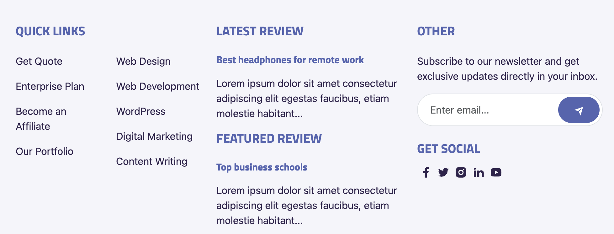
To wrap up this tutorial, we will take a brief look at two final ways that we can use to display a piece without a widget or the direct need for a piece-page. We are going to add a latest review to the footer using a component defined in the review piece module. We are going to add a featured review in the same section of our footer using a relationship field in our @apostrophecms/global module.
Adding a piece using a component
Open the modules/review/index.js file and add the following code after the fields object:
components(self) {
  return {
    async latestReview(req, data) {
      const review = await self.find(req)
        .sort({ createdAt: -1 })
        .limit(1)
        .toObject();
      return { review };
    }
  };
}
This code is creating a latestReview() method that queries the review-pieces to find the latest post and returns it as an object. Since we are in the review module, we only need to use self.find() to restrict the returned documents to review pieces. Next, we need to create markup to display the returned piece. Create a /modules/review/views/latestReview.html file and add the following code:
<h3 class="fw-bold h6 mb-3"><a href="{{ data.review._url }}">{{ data.review.title }}</a></h3>
<p class="mb-3">{{ data.review.searchSummary | truncate(100) }}</p>
This markup will construct a link using the data.review object returned by the component method. It is also using a field, searchSummary that is created when saving the review-piece to the database. This is generated by the @apostrophecms/search module and can be disabled if you choose. In this case, it is easier than adding an additional field to the review module schema and asking the content editor for a summary. This field will contain all the text added to the page, and we are using the built-in Nunjucks truncate() filter to add just the first 100 characters to the markup.
We still need to edit our footer fragment to display this component, but we are going to wait to modify this until we modify our modules/@apostrophecms/global/index.js file to allow the content editor to select a review.
Adding a piece with a relationship
Thus far, we have used the modules/@apostrophecms/global module as a place to house our topbar translation strings. It is also useful for adding content that will be used throughout the site in multiple modules. The schema fields that are added to this module are exposed as data.global in the data object available to all page types and widgets. In this case, we are just going to add a single schema field to deliver a selected review. We will return to the global module to finish our footer in a future tutorial. For now, create the modules/@apostrophecms/global/index.js file and add the following code:
module.exports = {
  fields: {
    add: {
      _featuredPost: {
        label: 'Featured Post',
        type: 'relationship',
        withType: 'review',
        max: 1,
        required: true
      }
    },
    group: {
      footer: {
        label: 'Footer',
        fields: [ '_featuredPost' ]
      }
    }
  }
};
This will add a single input field to our global configuration. This can be edited by the user by opening the menu located at the upper right of the admin bar. Again, since we are using a relationship type field, we need to preface our field name with an underscore.
Modifying the footer markup
Finally, we need to edit our footer to display the component. Open the views/fragments/footer.html file and modify the second column that has the h2 tag with the text "Latest Posts" to include our component markup:
{% fragment mainArea() %}
  <footer class="bg-info bg-opacity-10 pt-5 text-secondary">
    <div class="container">
      <div class="row">
        <div class="col-lg-4 py-3">
        <!-- remainder of code-->
        </div>
        <div class="col-lg-4 py-3">
        <!-- replace the markup in this column with the code below -->
          <h2 class="fw-bold h5 mb-4 text-primary text-uppercase">Latest Review</h2>
          {% component 'review:latestReview' %}
          <h2 class="fw-bold h5 mb-4 text-primary text-uppercase">Featured Review</h2>
          <h3 class="fw-bold h6 mb-3"><a href="{{ data.global._featuredPost[0]._url }}">{{ data.global._featuredPost[0].title }}</a></h3>
          <p class="mb-3">{{ data.global._featuredPost[0].searchSummary | truncate(100) }}</p>
          <!-- stop copying here -->
        </div>
        <div class="col-lg-4 py-3">
        <!-- Remainder of code -->
        </div>
      </div>
    </div>
  </footer>
{% endfragment %}
For the latest review, we are outputting the markup from the component created in our review module. For the featured review, we are adding essentially the exact same markup and populating it with the information from the data.global Note that the _featuredPost field will return an array, so we have to access the first item in that array with _featuredPost[0]. Even though this field is required in the global configuration, best practice would be to use an if conditional to make sure that the featured post document actually exists.
Summary and next steps
Pieces are a powerful way to produce reusable content that can be displayed throughout your project. In this tutorial, we created a piece-type called review for our project. When creating our piece module we looked at how to add localization strings for our custom module UI using the i18n property. This is slightly different from the localization that we did in the homepage topbar in Section 2, tutorial 2 on pages.
We also examined multiple ways to display our new pieces. First, we created a piece-page-type with HTML markup to display individual pieces using the show.html template and display multiple pieces using the index.html template. We utilized the Apostrophe pager module to look at how to limit the number of pieces displayed at once and create a breadcrumb trail for the display of the rest on our index page. We also looked at how we can have multiple index pages in our project, each with different pieces associated by extending the filterByIndexPage() and chooseParentPage() methods. This introduced the module configuration function, extendMethods(). Finally, we looked at how you can add choices to a select field dynamically in order to keep the category choices the content editor can make up-to-date.
Second, we looked at using widgets to display our pieces. The newly created widget can display either a single, selected review or a list of them. This led to the introduction of query builders for retrieving documents from the database from within our component. We also revisited getting schema info from the data.widget object. We completed this section by revisiting how to add style rules in our project.
Third, we looked at how we can display pieces on our pages using a component defined within the original piece-type module or through the global configuration. We modified the views/fragments/footer.html file that is displayed on each project page.
While it was mentioned in the introduction, one thing that we didn't cover in this tutorial is using pieces to store information that can be retrieved but isn't displayed anywhere on the site. For example, you could have a 'roster' piece-type with the names of each member on a particular team. In the end, you would display a 'member' piece on a team page through data stored in the roster piece. This is an easy way to dynamically change the content added to a page.
In the upcoming tutorial, we'll focus on crafting the final global element for our page: the navigation menu. Our exploration will encompass a variety of approaches to achieve this, delving back into the global configuration. Moreover, we'll investigate various data objects accessible on pages, which play a vital role in facilitating navigation creation.