
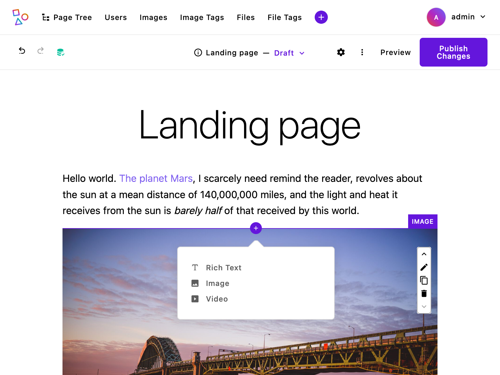
Areas and widgets
Areas are core to Apostrophe's in-context editing experience. They are special fields where editors can add one or more content widgets. A widget is a section of structured content, such as a block of rich text, an image slideshow, or a grid of featured products. Together, these two features let editors add custom and advanced content to a website, move it around, and edit it – all within a model that maintains the content design. Areas can be configured for editors to add content through a basic menu or through an expanded preview menu.
Basic area configuration
Like other fields, area fields are configured as part of the field schema for a page or piece type. The following example shows a landing page type with one area field named main. Every area requires a widgets option to configure the allowed widget types. This example includes three core widget types.
module.exports = {
  extend: '@apostrophecms/page-type',
  options: {
    label: 'Landing Page'
  },
  fields: {
    add: {
      main: {
        type: 'area',
        options: {
          widgets: {
            '@apostrophecms/rich-text': {},
            '@apostrophecms/image': {},
            '@apostrophecms/video': {}
          }
        }
      }
    },
    group: {
      mainArea: {
        label: 'Main page content',
        fields: ['main']
      }
    }
  }
};
Leave -widget out of area configuration
If you dig into the Apostrophe code, or read the guide to custom widget types, you may already know that widget module names end with -widget, such as @apostrophecms/rich-text-widget. This suffix is left off when configuring areas. The area knows these are widgets already and it does not seem necessary to require developers to write it over and over.
Limiting the number of widgets in an area
To limit the number of widgets allowed in a specific area, include a max option.
main: {
  type: 'area',
  options: {
    widgets: {
      '@apostrophecms/rich-text': {},
      '@apostrophecms/image': {},
      '@apostrophecms/video': {}
    },
    max: 3
  }
}
This can be especially useful when you want to allow only one widget of a particular type in an area. This can be a good way to add a special page introduction that should only include a single rich text area.
introduction: {
  type: 'area',
  options: {
    widgets: {
      '@apostrophecms/rich-text': {}
    },
    max: 1
  }
}
Expanded widget preview menu configuration
To enhance the editor experience, an expanded widget menu can be added instead of the basic menu. This context menu expands from the left side and provides a visual indicator for each widget in the area and support for organizing widgets into groups. These visual indicators can be preview images or icons.
Adding an area using the expanded menu requires a field schema slightly different from a basic area. The following example shows a landing page type with one area field named main.
module.exports = {
  extend: '@apostrophecms/page-type',
  options: {
    label: 'Landing Page'
  },
  fields: {
    add: {
      main: {
        type: 'area',
        options: {
      👉🏻  expanded: true,
      👉🏻  groups: {
            basic: {
              label: 'Basic',
              widgets: {
                '@apostrophecms/rich-text': {},
                '@apostrophecms/image': {},
                'topic': {},
                '@apostrophecms/video': {}
              },
          👉🏻  columns: 2
            },
            layout: {
              label: 'Specialty',
              widgets: {
                'two-column': {},
                'hero': {},
                '@apostrophecms/html': {}
              },
              columns: 3
            }
          }
        }
      }
    },
    group: {
      mainArea: {
        label: 'Main page content',
        fields: ['main']
      }
    }
  }
};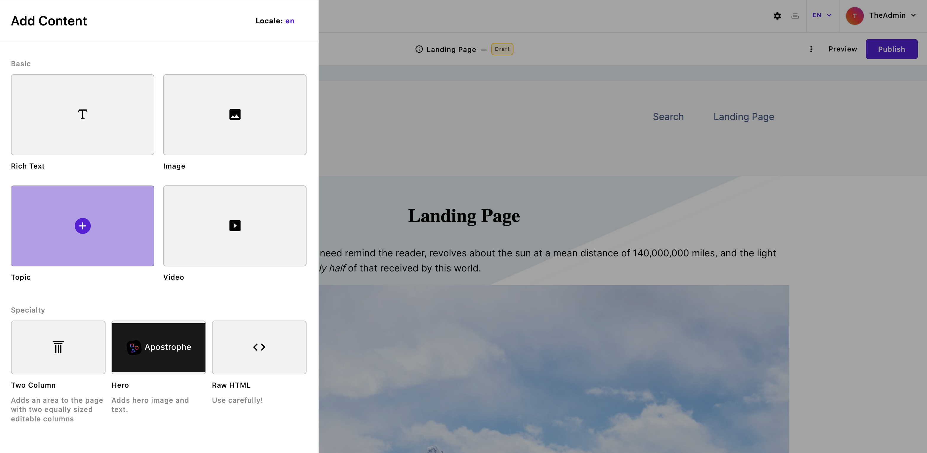
For the expanded widget preview menu, there are three settings to configure. The first option is expanded and takes a boolean to activate the expanded preview. This is required to activate the menu.
Second, widgets are added in a groups option that organizes the added widgets into specific regions of the menu. Each grouping of widgets is organized in a named object. In the example code, there are two such groups added within the area. The first is named basic, and the second is named layout. Each has a label key that provides the name displayed for the widget group. Each individual group has a widgets key that contains the names and options for all of the widgets to be included in that group. Like with the basic configuration, the widget names do not need the '-widget' suffix.
Finally, each group has a columns key that takes an integer from 1-4. This determines how many widgets will be displayed per line. The default value is 3.
An area configured in this way can still take a max option to limit the number of widgets to be added.
Widget preview options
previewImage: the simplest way to use an image
The previewImage option takes the extension, without prefixing, of the image to be used. For example, 'png' or 'gif'. The actual image should be added into the /public folder of the widget and named preview.<extension>, where extension matches the string passed to the option. If a file by this name exists in the public/ subdirectory of the module's project-level configuration, that will automatically be used in preference to a version found in the core module, but still we recommend setting previewImage to match your file extension in case the extension of the original ever changes.
The displayed dimensions of the previewImage depend on the number of columns being used for the row in which it will be displayed. For two columns, the displayed dimensions are about 240 x 120, or 2:1. For three columns, the dimensions are about 160 x 90, or 16:9. For four columns, the dimensions are approximately 120 x 66, or approximately 16:9. Choosing an image with a ratio of 16:9, with the center of the image well placed should work with all column sizes.
INFO
The extension should always be lower case.
previewUrl: when you need a custom image URL
The previewUrl option accepts a complete URL to the image being used. This option supports Apostrophe asset paths, making it easier to serve images kept in a particular module. If you do not wish to use the default filename, or wish to serve the image from a different location, this option gives you the flexibility to achieve that.
For example: if you wish to serve the file special-preview.jpg from your project-level modules/@apostrophecms/image-widget/public folder, you can do that with the following configuration:
module.exports = {
  options: {
    // The "my-" prefix tells Apostrophe to use the project-level
    // folder, not the one in the core apostrophe module
    previewUrl: '/modules/@apostrophecms/my-image-widget/special-preview.jpg',
  }
}
INFO
Note the my- prefix in @apostrophecms/my-image-widget. Without this prefix, Apostrophe would look for the file in the core Apostrophe npm module, and would not find it.
previewIcon: when you prefer an icon to an image
The final option is previewIcon. This option takes any icon that has already been registered. Alternatively, additional Material Design Icons or icons from your own Vue files can be registered using the icons property within the module. If it is present, the icon option will be used if no previewIcon option is set.
Adding placeholder content to widgets
The rich text, image, and video widgets all display placeholder content by default. Additionally, these modules do not show an initial editing modal. This placeholder content will not be displayed in either the draft preview or the live page if published. This default behavior can be turned off by setting the placeholder option of the relevant module to false. This will eliminate the display of placeholder content and open the editing modal when the widget is selected.
Custom placeholder content can be added to the image and video widgets through the placeholderImage and placeholderUrl options.
For the image widget, the placeholderImage option takes just the file extension, like jpg (note no .). You must also copy a matching file in the public folder of the module, e.g. copy that image to /modules/@apostrophecms/image-widget/public/placeholder.jpg (the name must be placeholder and the extension must match placeholderImage).
placeholderImage is the easiest way, but for those who prefer to change the filename or specify a complete URL to the placeholder image, see also the placeholderUrl option.
For the video widget, the placeholderUrl option takes the URL of a video on a site that the video widget already supports, like YouTube.
INFO
For legacy reasons, placeholderUrl is also supported for image widgets, however we do not recommend its use because it is challenging to determine the correct asset URL. Use placeholderImage and let Apostrophe figure it out for you.
The custom placeholder content for the rich text widget is passed as a string to the placeholderText option in the /modules/@apostrophecms/rich-text-widget/index.js file. This can be either a simple string or a namespaced i18n string.
Both the image and video widgets have a placeholderClass option that takes a string and adds that class to the content wrapper.
Adding areas to templates
Areas have a special template tag to add them in template markup. It requires passing two arguments: the area's context and the area name.
{% area context, 'name' %}The context refers to the data object that the area field belongs to. This could be a page, a piece, or a widget. In the landing page example above, the main area belongs to a landing page. In that case, the context would be that page's data object in the template: data.page.
{% area data.page, 'main' %}The template tag knows to use the area data on data.page.main, check for the widgets allowed in that area, and render the area using the correct widget templates.
Passing context options
Most widget options must be included in the area field configuration. For example, you can configure the rich text widget to use particular formatting controls. The server uses these options to properly validate user input.
main: {
  type: 'area',
  options: {
    widgets: {
      '@apostrophecms/rich-text': {
        toolbar: [
          'bold',
          'italic',
          'strike',
          'link'
        ]
      }
    }
  }
}
INFO
Learn more about rich text options in the section on core widgets.
In other situations, you may need to pass the widget template options that only apply to a specific context. One example of this is the sizes attribute for the core image widget's img tag. Since that attribute tells browsers which file versions to use in a responsive image, it may be different when the image is a small thumbnail as opposed to when it is a larger featured photo.
These can be added in an object after the area tag arguments using the with keyword.
{% area data.page, 'main' with {
  '@apostrophecms/image': {
    sizes: '(min-width: 600px) 45vw, (min-width: 1140px) 530px'
  }
} %}
The object following with should include keys matching widget type names, without the -widget suffix (e.g., the @apostrophecms/image). The context template will pass those options into the proper widget template as data.contextOptions. In the example above, the core image widget template, and only that template, would be able to use the data as:
{{ data.contextOptions.sizes }}Any context options for widget types not allowed in the area are ignored.